London Web Standards: Beautiful Design for Everyone with Ann McMeekin
Review: LWS May: Beautiful Design for Everyone at The Melton Mowbray, 18 Holborn, EC1N 2LE, London 19:00 to 20:30
This event was originally going to be a double act, but Antonia Hyde unfortunately had to pull out. We were fortunate to have someone of the calibre of Ann McMeekin to pick up the slack. Ann had some very beautiful slides and spent a lot of time talking about each one, I made some necessarily limited notes from which I will attempt to reconstruct the gist of what she said (hopefully I don't misrepresent anything too badly!) and tried to locate some of the pictures from the presentation to give the flavour of it.
Ann began by talking about her background as an accessibility consultant, which she initially thought would be her dream job but, over time, she came to realize that what she really valued was not great accessibility but great design. Great design, of course, includes accessibility, but the focus is not on a check-list of requirements but the overall experience each user will have.
While accessibility is a widely accepted goal, honest discussion about it is often difficult as many people find talking about disability uncomfortable. A common reaction when seeing for the first time the rigmarole a screen reader user has to go through to get useful information out of some websites, is to feel empathy and start thinking how terrible it must be to put up with that, which leads immediately to that uncomfortable feeling. However, to provide accessible design solutions we must get past the stage of empathy in order to develop understanding about what tools we need to provide. Disabled people are not passively waiting for us to make their lives better, they just want the tools to make a better life for themselves.
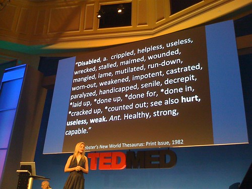
Next Ann showed us a segment from a TED talk by Aimee Mullins. Aimee, who had her lower legs amputated as a child, famously competed in the 1996 Paralympics on a set of carbon fibre 'cheetah legs' (this TED talk includes a description of her experiences at the games) and has since gained fame as a speaker, model and actress. Aimee talked about her collection of prosthetic legs and the different abilities and attributes each provided her with, like the cheetah legs for running or the set she was wearing for the talk which added six inches to her normal height:
I have a variable of five different heights. (Laughter) Today, I'm 6'1". And I had these legs made a little over a year ago at Dorset Orthopaedic in England and when I brought them home to Manhattan, my first night out on the town, I went to a very fancy party. And a girl was there who has known me for years at my normal 5'8". Her mouth dropped open when she saw me, and she went, "But you're so tall!" And I said, "I know. Isn't it fun?" I mean, it's a little bit like wearing stilts on stilts, but I have an entirely new relationship to door jams that I never expected I would ever have. And I was having fun with it. And she looked at me, and she said, "But, Aimee, that's not fair."
For Aimee the loss of her lower legs is not so much a disability as an opportunity. And the opportunity isn't just to 'be normal', whatever that may mean, she can exceed normal.
She doesn't see herself as limited, and so she isn't limited (from another TED talk by Aimee):
Good design should create this same feeling of empowerment, for everybody. It is not about ticking off boxes, but about enabling people to achieve their goals, provide tools for augmentation, not just equalization. And just because a tool serves a purpose, doesn't mean it can't be beautiful:I loved almost everything about my time spent at this hospital, with the exception of my physical therapy sessions. I had to do what seemed like innumerable repetitions of exercises with these thick, elastic bands -- different colors -- you know, to help build up my leg muscles. And I hated these bands more than anything. I hated them, had names for them. I hated them. And, you know, I was already bargaining, as a five year-old child, with Dr. P to try to get out of doing these exercises, unsuccessfully, of course. And, one day, he came in to my session -- exhaustive and unforgiving, these sessions -- and he said to me, "Wow. Aimee, you are such a strong, powerful little girl, I think you're going to break one of those bands. When you do break it, I'm going to give you a hundred bucks."
Now, of course, this was a simple ploy on Dr. P's part to get me to do the exercises I didn't want to do before the prospect of being the richest five year-old in the second floor ward, but what he effectively did for me was reshape an awful daily occurrence into a new and promising experience for me. And I have to wonder today, to what extent his vision, and his declaration of me as a strong and powerful little girl, shaped my own view of myself as an inherently strong, powerful and athletic person well into the future.
This is where it really hit home for me -- that my legs could be wearable sculpture. And even at this point, I started to move away from the need to replicate humanness as the only aesthetic ideal. So we made what people lovingly referred to as glass legs even though they're actually optically clear polyurethane, a.k.a. bowling ball material. Heavy! Then we made these legs that are cast in soil with a potato root system growing in them, and beetroots out the top, and a very lovely brass toe [...] Then another character was a half-woman, half-cheetah -- a little homage to my life as an athlete. 14 hours of prosthetic make-up to get into a creature that had articulated paws, claws and a tail that whipped around, like a gecko. And then another pair of legs we collaborated on were these look like jellyfish legs. Also polyurethane. And the only purpose that these legs can serve, outside the context of the film, is to provoke the senses and ignite the imagination. So whimsy matters.
So prosthetic legs are not just a utilitarian accessibility tool but something beautiful in their own right, a work of art, and the same can be true of our own designs. As to how to achieve beautiful, accessible design, Ann covered that in three sections: Structure; Alternatives; and Flexibility.
Structure
The foundation of good design is structure, which implies planning. As an example of what happens when there's no structure Ann talked about the Winchester Mystery House. This was a house built by the widow of a member of the Winchester Repeating Arms Company dynasty, she believed that the ghosts of all the people ever killed by one of the rifles were out to get her and the only way to keep them at bay was to keep building the house. So it was built, 24 hours a day for 38 years with no plan or goal in mind other than to be building continuously.
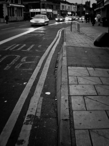
Although the end result is, in many ways, fascinating, from the point of view of being a usable living space it's a complete disaster - it's almost impossible to navigate without a map, and so unusable. If you are willing to do a little planning, and from the recent boom in User Experience it seems companies are able to appreciate the value, then you can build an accessible structure without compromising your design. Ann had a number of examples, the first was these bus stops in Bristol:
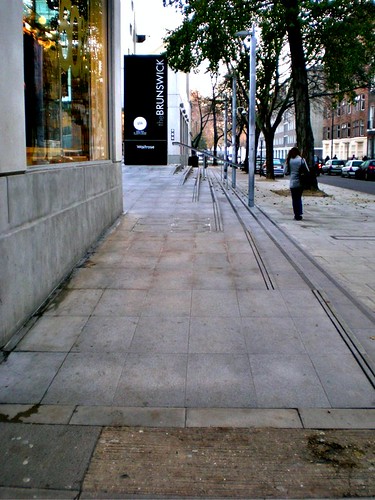
The paving is raised at each bus stop, even well out into the suburbs, so that people on wheel chairs (and mothers with wheelchairs) can simply roll on to the bus - no need for leaning buses that the driver has to remember to operate, or special ramps that have to be got out and attached, slowing everyone's journey. The bus stops are a shared space, anyone can use them, there was no need for having 'normal' bus stops and 'special' bus stops. Another example of shared spaces in action is the steps at the Brunswick Shopping Centre. Ann had been walking up and down these steps for two months before noticing that they had an integrated ramp:
Alternatives
As we've just seen, alternatives don't have to be hidden - there doesn't have to be a ramp round the back while everyone else goes up the steps at the front, but they do have to be discoverable. An example is Braille labels - you see these all over the place now alongside the visible labels on signs and buttons, but how do these actually help blind people? Does anyone really expect blind people to walk around feeling all the walls on the off chance there'll be Braille there? Designers have ticked the box - 'provide an alternative for blind people' - but they've not really thought about what a blind person needs to be able to navigate the environment. Don't simply provide a Braille version of the menu, think about what a blind person needs to be able to independently go to a restaurant and order a meal.
One area where it's always appropriate to provide text alternatives is for pictures and videos. Captions on images can be integrated into the design fairly easily, like, for example, on the The Big Picture blog on Boston.com. Transcripts for videos have traditionally been regarded as prohibitively expensive, especially for small producers. But there are a number of cheap options these days:
- If you're sufficiently iconic, you can crowdsource your transcription, like zefrank
- Services like CastingWords will transcribe for $1.50 per minute
Flexibility
Not all disabilities are constituted of a fixed and unchanging set of symptoms (eg. MS sufferers can vary from day to day and hour to hour). An insufficiently flexible site, may, even for the same user, be reasonably usable one day, but unusable the next.
Also not all people who would benefit from making use of 'accessible' options will self identify as disabled. Older users are likely to benefit from font sizing and readability options just as much as the partially sighted or those with learning disabilities, but they may be unlikely to click on a link for 'disabled users' in order to find them.
When thinking about flexibility bear in mind that people don't need to have the same experience, but that doesn't pre-dispose that anyone should have a lesser experience. Ann used an example of a blind friend of hers who liked to visit the Tate Modern. You might wonder what a blind person could get out of looking at a painting, but he could listen to the painting by listening to ambient sound reflected off them, the different colours get reflected in different ways. Obviously he's not getting the same experience a sighted person would do, bet then sighted people aren't getting the experience he is and both can get a lot out of it (and, by the way, the Tate Modern has help and tours for blind and visually impaired visitors).
If you have compelling content, of course, you'll get users no matter how badly designed your site is. Amazon, for a long time, had terrible accessibility, but everybody liked cheap books. In this situation users develop coping strategies - Ann told us about one blind user who'd worked out a very detailed method of getting to what he wanted on Amazon, to the extent that it went "do this, then hit the tab key 43 times." Sure you might take comfort in the fact that someone has figured out how to use your site anyway, but did you need to make it that painful?
To finish with, Ann reminded us that while good design can be difficult, it's from solving the difficult problems that we derive the most satisfaction.
Post Talk Discussion and Questions
To conclude the talk, instead of going straight into questions, Ann asked us for examples of good design to add to her, regrettably, somewhat small collection. The first example was a blind person who went around sticking irreverent and subversive Braille messages on to signs, a sort of graffiti that few people are aware is even there. Another person mentioned some recent improvements to the riverside area in Bedford which had been done with accessibility in mind so that everyone could enjoy the river.
As counterpoint, another attendee described a lift he'd seen where they'd put Braille labels on the buttons, the only problem was - they were touch sensitive buttons! This was clearly an example of ticking the boxes rather than trying to understand what a blind person would need in order to use the lift.
There were a lot of other good examples and discussion but I'm already closing in on seven days to write up a two hour talk, so I'll leave it there. Another excellent LWS event, out of 5 once again. Antonia will hopefully be able to make a future talk, in the meantime watch out for the June event on Flash vs HTML5.
| Print article | This entry was posted by robertc on 31/05/10 at 12:40:37 am . Follow any responses to this post through RSS 2.0. |


 Hello! HTML5 and CSS3 available now
 Early access to HTML5 in Action available now